Hi ,
Last week, the government released its annual update to the Households Below Average Income data, which looks at incomes, distribution, poverty, and more.
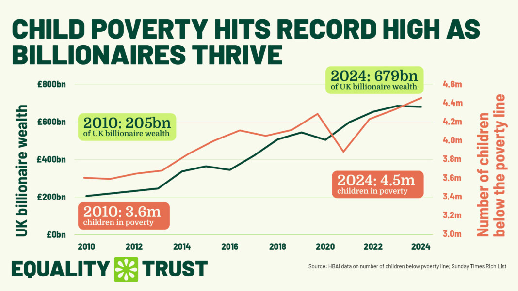
The data indicates a fall in household incomes, especially for the poorest 10% of society, and a growth in child poverty – something which is in itself scandalous when the super-rich are benefiting from record profits and shocking increases to their wealth.
One measure that hasn't shown an increase this year, however, is the Gini coefficient. This is the most widely-used measure of income inequality, where a high value shows a few individuals have most of the income and a low value indicates income is shared more equally. In the UK, the Gini coefficient fell throughout the 20th century as society became more equal, then rose in the 80s and 90s as we evolved a more unequal system. Academics describe this as a "u-shaped" trend, as in "u should not have done this." The result is our Gini score, measured this week at 0.39, is relatively high compared to OECD and EU countries, but lower than the US.
Since the mid 1990s, though, the Gini coefficient has remained more or less flat, and that's interesting. This data has even been used by people in the government or advocates for reduced taxes on the rich to claim that our current, broken system is reducing inequality despite a decade of tax handouts for the richest and crippling austerity for the rest of us. In this reading, allowing the rich to accumulate vast wealth and stripping away social safety nets has actually benefited the poorest.
However, if you're living in our society, it's very obvious that this doesn't seem to be true. Poverty and wealth at the very top are skyrocketing at the same time, social conditions have worsened, and there's a pervasive feeling that we're being ripped off. So why is the most common measure of inequality not reflecting this?
The first issue is that it measures incomes. Wealth in the UK is vastly more unequal than incomes, but it's wealth that has seen such massive growth for the richest over the last decade. Estimates for the UK's wealth Gini coefficient range from 0.58 to 0.71, much more than the income score of 0.39. Wealth distribution is also measured much less frequently than income, making it much harder to track. This is a problem, because it's wealth that is becoming the defining inequality of our time and the one influencing how power is wielded.
But even if you began measuring wealth more often, both coefficients would still give you one national average and miss how inequality is changing. Overall inequality is flat, but a lot of that is caused by big increases in the minimum wage over the last decade. If you're not covered by that, you haven't seen any improvement – while the richest have been pulling away faster and faster, with the income share of the top 1% rising by 135% between 1980 and 2007. The authors of the HBAI data admit this is something they can't measure very well.
The gap between the poorest and the middle and the gap between the middle and rich behave very differently, and we're seeing more and more that there's a also a growing gap between the rich and the super-rich. None of these measures can address the way that our political system is dominated by the preferences of the super-rich, despite clear public will at all income levels behind measures like wealth taxes to reduce inequality.
We need better measures of inequality and better understanding of what inequality actually is by policy-makers. Politicians can – and do – tell us that their polices are about fairness until they're blue in the face, but the lived experience of people on the sharp end of inequality is what should matter.
|